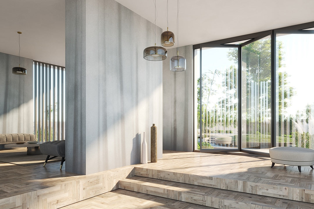

An introduction to bright wall colours
The right colour is one of the simplest ways to make a room feel brighter and more welcoming. Shades can shift both mood and the way light is perceived in a space. Colours like white, yellow, and pink can all be used to lighten up walls and create a genuinely comfortable atmosphere. Below you'll find inspiration for choosing colour room by room — sunny, fresh tones for energy and vitality, softer ones for a more delicate feel. Getting your wall colours right doesn't just improve how a home looks, it also shapes how pleasant it is to actually live in, from the kitchen to the bedroom.
Which colours make a room feel brighter? One idea for every space
Natural light matters more than almost anything else for wellbeing. Whether at home or in the office, spending your day in a bright space affects your mood, since it supports the brain's production of dopamine, serotonin, and endorphins — the chemistry behind feeling calmer at home and more productive at work.

When large windows or extra openings aren't an option, interior decoration can pick up the slack: pastel and light-toned paint genuinely does make a room feel brighter.
Want to bring new light into your home with something original? Explore our light-toned wallpaper collection: artistic surfaces for bright, characterful rooms.
Choosing the right bright colours can visually enlarge a space, and for a more contemporary look, pairing them with satin or glossy finishes on furniture boosts the light even further. Light itself changes how a colour reads at different times of day — here's what to consider room by room.
White: the classic choice for a brighter room
The colour of calm and a natural fit for anyone drawn to minimalist chic, white is the obvious pick for rooms that need to make the most of natural light.

Shades of white for the bedroom and living room
The direction your walls face changes how sunlight hits them throughout the day — and that affects how any colour you choose reads, white included. Not all whites are equal: for a warm, welcoming living area, go for a shade closer to cream; for the bedroom, an icy white works better, since it naturally picks up soft grey and blue undertones that support sleep.
White for a home office or workspace
White also suits anyone refreshing a home office. To avoid flattening the space, consider decorating one or two walls with a design suited to the room's function — urban-inspired patterns work well here. For work areas, vinyl-coated wallpaper is worth considering: unlike traditional wallcoverings, it holds up much better over time. Warm white in particular supports focus and productivity in a study or home office.
Warm colours for a brighter living room
The living room is where most daily life happens — family time, guests, everything in between. If you're rethinking your living room colours, warm, welcoming tones are generally the better call, wrapping the room in a sense of comfort.

If your taste leans romantic, powder pink is the softest option for an elegant, feminine feel. If you love travel and lean towards ethnic-chic style, yellow and earthy tones work especially well in west-facing rooms, where sunset light fills the walls with warmth.
Warm tones for outdoor spaces too
To amplify a savannah or jungle-inspired mood, the natural tones of exotic-style wallpaper work beautifully on the wall behind a sofa — and this style suits outdoor spaces just as well, like a veranda or terrace, provided you choose wallpaper designed for outdoor use, weather- and sun-resistant.

Bedrooms wrapped in blue and the colours of the sky
The bedroom is perhaps the room where orientation matters most. Biophilic design teaches us that, here especially, it's worth making the most of morning light to support a natural wake-up. If your bedroom faces east — as recommended by the ancient art of Feng Shui — choose delicate shades that enhance the morning light and afternoon shadows, for a soft, calming effect.

Blue and calming shades for restorative sleep
In the bedroom, relaxing colours genuinely help you sleep better, and blue is one of the strongest options. Its different shades can echo the movement of the sky and set the tone for calmer dreams. Decorating the wall behind the headboard, rather than the ceiling, brings a real sense of calm — from deep midnight blue to powdery light blue, both support a more restorative atmosphere.
Bright colours for a kids' room
Children and teenagers spend a lot of time in their room — playing, studying, and recharging — so filling it with light and colour matters. Current trends lean towards pastel and neutral tones for an elegant, welcoming kids' room.
Bright, saturated tones for a play space
Is there a better room than a child's bedroom to go bold with pattern and colour? Saturated tones — orange, green, fuchsia, sky blue — can take centre stage alongside softer, reassuring decorative touches.

Don't miss the imaginative worlds in wallpaper designed for kids' rooms, especially set against clean, light furniture. Blue or yellow tones, in particular, can make the room work equally well for studying and playing.
Bathroom brightness: glass, water, and shades of grey
Feng shui recommends placing the bathroom facing north, in the quietest, most private part of the home — which usually means less natural light. To play up the contrast between light and shadow, a delicate colour palette creates a relaxing, comfortable feel. The most natural inspiration comes from water itself, the dominant element in this room, with its shades of grey-green and blue.

As these photos show, modern wallpaper can lighten a bathroom too — in this case, choose fibreglass and light shades like taupe, which reflect light and make the space feel bigger. For something more sophisticated, watercolour-effect wallpaper brings soft, blended tones that lighten a room in a more contemporary way.
Building a personalised bright colour palette
Choosing bright colours doesn't mean giving up personality. Pastel shades — powder pink, dusty blue, vanilla yellow — offer endless variations that suit anything from Scandinavian minimalism to '70s retro.

A single decorative wallpaper wall can transform a room in one move. Contemporary graphic patterns, paired with a desaturated grey, boost the sense of brightness and add real visual depth — a refined solution for anyone after a considered look without sacrificing function.
The secret? Experiment. Try mixing warm and cool tones, or play with tone-on-tone layering: the result is a room that feels genuinely balanced and unmistakably your own.
Colours to avoid for a bright room
When it comes to wall colour, it's worth steering clear of shades that tend to absorb light. Black, petrol blue, chocolate brown, or aubergine purple can all visually weigh a room down, especially over large surfaces or in spaces that get less sun.
That said, not every dark colour is off the table. Used carefully, they can add elegant contrast — the trick is choosing where, reserving them for a piece of furniture, an alcove, or a single accessory rather than the whole wall.

Conclusion: light as a design principle
Designing around light means thinking in terms of atmosphere and wellbeing. Colour isn't just an aesthetic choice — it's a genuine tool for shaping a space. The right bright palette can change how a room feels, improve everyday quality of life at home, and reflect who you are.
Painting your walls, choosing bright wallpaper with airy tones, or adding reflective surfaces — all are ways to turn your home into a bigger, calmer, more energising place to be.